
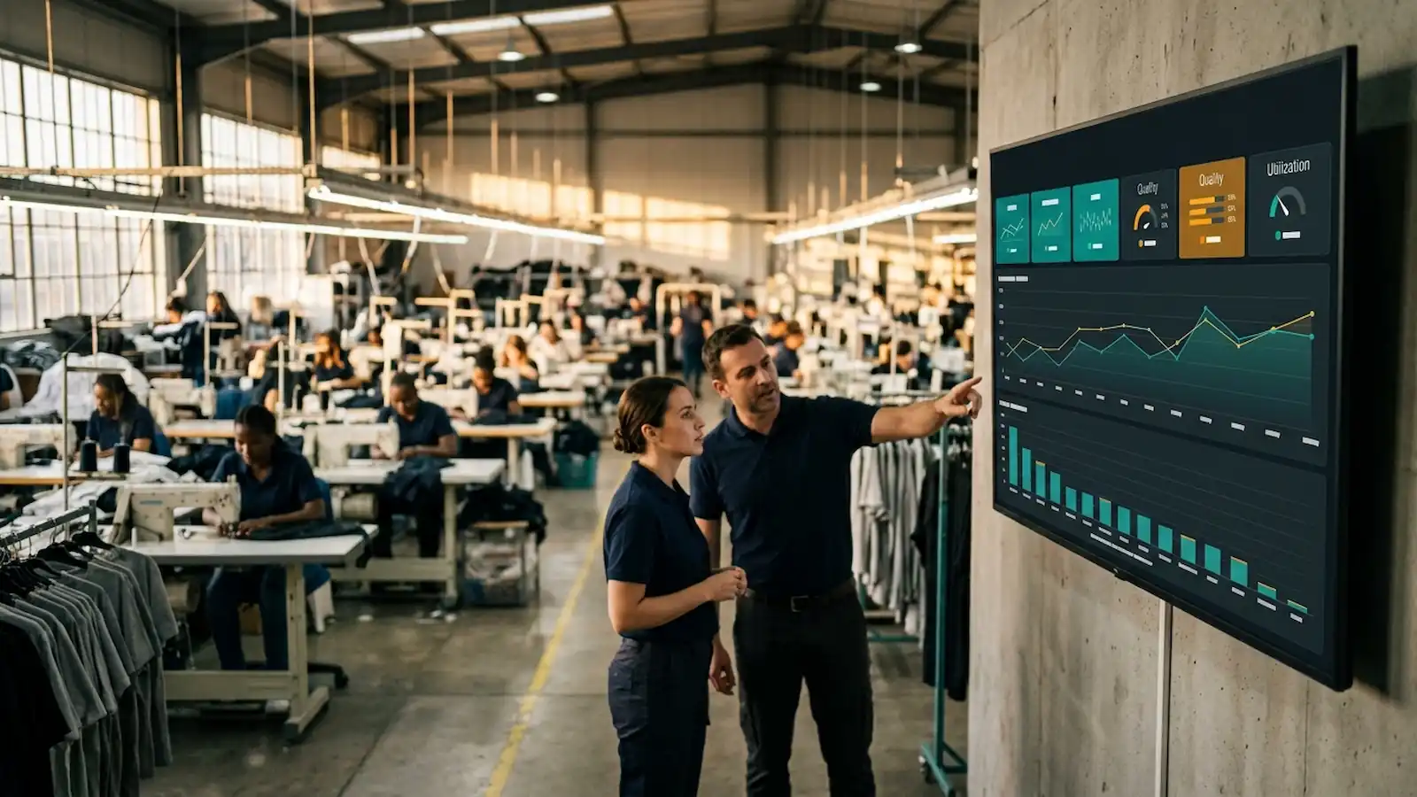
You commissioned the dashboard. The screens went up on the floor. For two weeks, everyone looked at them.
Then the supervisors quietly went back to the whiteboard and the WhatsApp group. Three months later, one of the screens is displaying a Windows update notification and nobody has noticed. The IT budget is spent, the credibility is gone, and the next time someone proposes a factory KPI dashboard, the room will be tired before you finish the sentence.
Here is the uncomfortable truth found in every failed rollout worth rescuing: the failure is almost never technical. The database was fine. The BI tool was fine. What killed it was fuzzy metric definitions, refresh timing that did not match how people work, and tiles that nobody could act on.
This guide is the design sequence to use before a single chart gets built, worth reading alongside a broader look at what a mid-sized manufacturer should build first in its analytics stack, since a dashboard is only one layer of that stack. Seven rules, in the order they matter.
Why Most Factory KPI Dashboards Are Abandoned Within a Quarter
A dashboard is not a reporting artefact. It is a decision instrument. Every tile on the screen should have an owner and an action attached to it. If nobody would do anything differently based on a number, that number is decoration, and decoration is what trains people to stop looking.
The abandonment pattern is remarkably consistent across plants:
Week 1-2: Novelty traffic. Everyone opens it because it is new.
Week 3-6: First public disagreement about a number in a production meeting. Trust cracks.
Week 7-12: Supervisors revert to the source they trust: usually a manual board or a chat group.
Month 4+: The dashboard becomes a screen that management points at during buyer visits.
Rule 1: Start With the Decision, Not the Data
Most production dashboard design projects begin with a data audit. That is backwards. Data availability tells you what is possible, not what is useful.
Instead, write down in plain language the five decisions the dashboard exists to support. On a garment production floor, they are almost always:
Do we need to move labour between lines or operations right now?
Do we need to escalate a machine or maintenance problem?
Are we going to ship this order on time?
Is quality drifting on a style or an operation?
Are we burning overtime we did not plan for?
Every proposed tile then has to justify itself against that list. If a metric does not feed one of the five decisions, it goes into a monthly report, not onto the wall.
Field note: In one 42-line factory, this exercise cut the proposed tile count from 31 to 9. Daily usage went from sporadic to 80%+ of supervisors within six weeks, and it was the removal that did it.
Rule 2: Define Every Metric to the Point of Tedium
The single most common cause of dashboard death is two people disagreeing about a number in a meeting. That is a definition problem, not a data problem, and no visualisation will fix it.
Every metric needs a written spec, signed off, before it is built. This is what a proper KPI metric definition looks like:
Field | Example |
|---|---|
Name | Line efficiency |
Formula | (Produced units × SMV) ÷ (Operators × minutes worked) |
Numerator source | Hourly output log, end-of-line scanner |
Denominator source | Attendance system, actual clocked minutes |
Excludes | Sampling, rework, meeting time |
Grain | Line, hour |
Target | 62% for weeks 1-2 of a style; 78% thereafter |
Owner | Production Manager |
The "Excludes" row is the one that ends arguments. Half of all disputes about the line efficiency metric are really disputes about whether sampling minutes count, which is exactly why getting the standard minute value calculation right matters before the dashboard is ever built. Settle it on paper, once, and the meeting moves on to the actual problem.
Who Signs the Spec
Three signatures, minimum: the metric owner (accountable for the number moving), the data owner (accountable for the source system's accuracy), and the person who will be measured by it. That third signature is the one people skip, and it is the one that prevents the "this number is unfair" objection six weeks later.
Rule 3: Match Refresh Rate to Decision Rate
Refresh frequency should equal the frequency at which somebody can actually do something.
Hourly output → hourly refresh. A supervisor can move an operator within the hour.
Absenteeism trend → weekly refresh. The response is a hiring or roster decision.
Cost per minute → monthly refresh. The response is a costing or contract decision.
Putting real-time production monitoring on a metric with a monthly response cycle does not create urgency. It creates anxiety, and anxiety is what makes people close the tab. The reverse error is just as damaging: a daily refresh on a metric that needs an hourly response means the decision is always made without the dashboard, which teaches everyone that the dashboard is not where decisions live.
Rule 4: Use the Three-Band Layout
After a decade of iterations, the layout that survives contact with a real production floor is the same three-band structure every time.
Top strip: "Is anything on fire?" Four to six tiles, current shift only, each with target and variance, not just the raw value. No history, no trend lines. Readable from six metres away.
Middle band: context. The same metrics, trended over 14 days. A single number without a trend invites over-reaction to noise; this band is what stops a supervisor from chasing a one-hour dip, the same discipline behind a proper statistical process control approach to shop-floor data.
Bottom band: the breakdown. By line, by style, by defect type. This is where someone goes after the top strip tells them something is wrong.
Three sections, one screen, no scrolling on the display it will actually be shown on. If it needs a scroll on a 1080p wall screen, you do not have one dashboard: you have two, and you should build them as two.
Rule 5: Avoid the OEE Trap
Overall Equipment Effectiveness is availability × performance × quality. On capital-intensive equipment (knitting machines, dyeing lines, laser finishing), it is genuinely one of the most useful numbers you can publish.
As a headline metric for a sewing floor, it is close to useless. Two reasons: the constraint is labour, not machine time, because OEE was designed for a world where the asset is the bottleneck, and on a sewing line the operator is; and a composite number hides which component moved, since a 4-point OEE drop tells you nothing about whether you have a downtime problem, a speed problem, or a defect problem.
The rule: if you publish an OEE dashboard tile, publish the three components beside it. Always. A composite that cannot be decomposed on the same screen is a number people will learn to ignore.
Rule 6: Build the "Why Is This Number Wrong?" Path
Every metric will be challenged. Plan for the challenge instead of being surprised by it. Give each tile a drill-through to the underlying rows: the actual production entries, the actual downtime records, the actual QC tickets, with timestamps and operator IDs.
A dashboard that cannot show its work loses the first argument it has, and it never recovers. That is not an exaggeration; it is the most reliable pattern in this entire field. The team stops trusting the tool, and trust does not come back with a redesign.
Practical minimums for garment factory analytics credibility: one click from any tile to the raw rows behind it, a visible "last updated" timestamp on every band, a named contact for data disputes on the screen, and a change log for metric definitions so nobody wonders why last month's number moved.
Rule 7: Test for Abandonment at Week Four
Do not measure success by whether the project shipped. Measure it by whether people open it. Four weeks after launch, pull the access log. If the supervisors it was built for are not opening it daily, the dashboard has failed, and no amount of visual polish will fix it.
Then do the part most teams skip: ask them what they look at instead. It will usually be a whiteboard or a WhatsApp group. Find out what that source gives them that yours does not. In experience, the answer is almost always the same two things: speed and trust. Not detail. Not more charts. The whiteboard wins because it is instant and because the person who wrote the number is standing next to it.
Design your manufacturing KPI dashboard to beat the whiteboard on those two axes and it will stick. Design it to impress a boardroom and it will be a screensaver by March.
Your Pre-Build Checklist
The five decisions are written down and every tile maps to one
Every metric has a signed spec including an "excludes" row
Refresh rate matches the response cycle for each metric
The layout fits the three-band structure on one screen, no scroll
Any OEE tile publishes its three components alongside it
Every tile has a one-click drill-through to raw rows
A week-four access-log review is already scheduled and owned
Final Word
A factory KPI dashboard is not a data project. It is a behaviour-change project that happens to involve data.
The plants where dashboards survive are not the ones with the best BI licence. They are the ones where somebody did the unglamorous work of defining "efficiency" on paper, arguing about the excludes row, and checking the access log a month later. Get the definitions right and the technology is straightforward. Get them wrong and no tool on the market will save you.
For the WIP and flow metrics that often feed these tiles in the first place, see our guide to a kanban pull system between cutting and sewing.


Discussion0
Loading the discussion…