
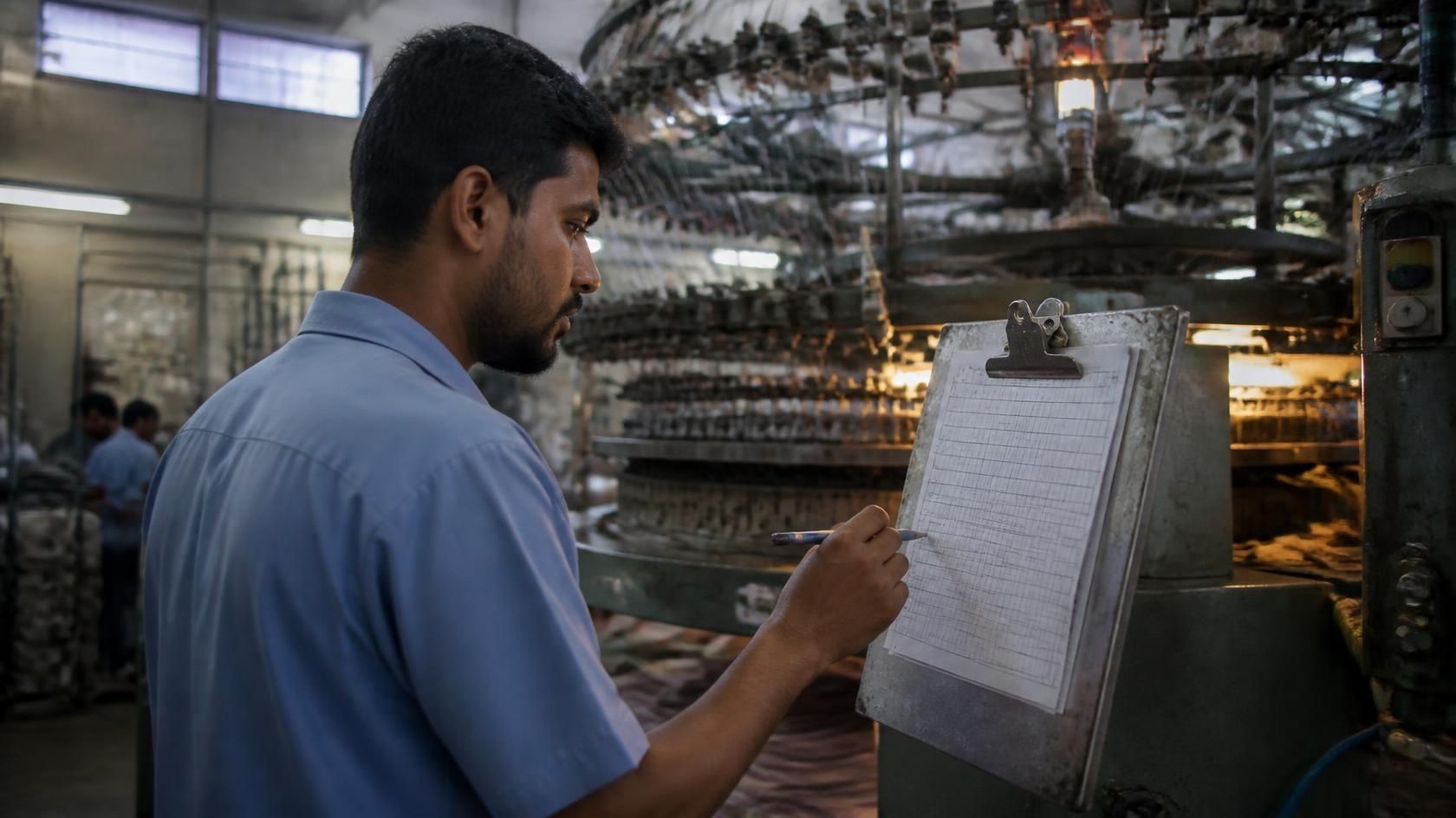
A knitting supervisor sees a GSM reading of 184 against a 180 target and tells the operator to slow the take-down. Two hours later the next roll reads 176, so the setting goes back. By shift end the machine has been touched four times and the fabric is measurably more variable than if nobody had gone near it.
That is the exact problem statistical process control was built to solve, and most factories still try to solve it with instinct and seniority. The cost is not abstract. Off-target GSM becomes unbudgeted fabric consumption, rolls held for re-inspection against an AQL 2.5 sampling plan, and shade lots that will not match at finishing. One avoidable re-dye on a 3,000 kg lot burns a day and a half of dyehouse capacity, the chemicals twice, and a promised delivery date, the kind of loss a regression model for dyeing recipe cost can often flag before it happens. Nobody logs that as an SPC failure.
This guide is for people who do not enjoy statistics and have to run this on a floor tomorrow: the one confusion that causes most of the damage, a chart-selection table you can use as-is, the run rules worth adopting, subgrouping in plain language, a worked Cp and Cpk calculation, and why most SPC programmes quietly die.
Why control limits are not specification limits
Control limits tell you what your process actually does. Specification limits tell you what your customer needs. Control limits are calculated from your own production data. Specification limits are handed to you in a tech pack. A process can sit perfectly inside its control limits and still fail specification on every unit, or breach a control limit while every piece is comfortably within tolerance.
The practical rule: never draw specification limits on a control chart. Once a red spec line appears, operators stop reacting to process signals and start reacting to tolerance: tampering whenever a reading nears the line, ignoring a genuine drift that stays inside it. Keep two documents: the control chart governs the process, the inspection record governs the product. Mixing them destroys both.
Common cause or special cause: the only question the chart answers
Common cause variation is the normal noise of a stable process: each reading is unpredictable, the range they fall in is not. Special cause variation comes from something identifiable: a new operator, a worn cutter, a different yarn lot, a spreader at a different tension. Adjusting a process in response to common cause variation has a name: tampering, and it provably increases variation rather than reducing it. The knitting supervisor above was tampering, competently and in good faith.
The whole apparatus of control charts exists to answer one question: is this variation worth chasing? That is the most valuable thing statistical process control teaches, and it costs nothing to adopt.
Which control chart for which data?
Data type | Situation | Chart | Apparel example |
|---|---|---|---|
Measurement | Subgroups of 2–9 | X-bar and R | 5 GSM cuts per roll, 4 rolls per shift |
Measurement | One reading at a time | Individuals and moving range (I-MR) | Dyebath pH; one shade DE reading per batch |
Count of defectives | Constant sample size | np chart | Defective pieces per fixed 200-piece audit |
Proportion defective | Varying sample size | p chart | Percent defective per bundle, size varies |
Count of defects per unit | Varying opportunity | c or u chart | Fabric faults per 100 linear metres |
The most common error is converting measurement data into pass/fail and charting the pass rate. If you measured a number, chart the number. I-MR is the workhorse in apparel, not X-bar and R: most of what matters, a dye batch, a wash load, a lay, gives one meaningful reading at a time, and forcing it into subgroups is dishonest.
What is rational subgrouping, in plain language?
A subgroup is a handful of readings treated as one point on the chart. The working rule: collect within a subgroup over the shortest practical window, and let the differences you care about show up between subgroups. Five GSM cuts from one roll is a rational subgroup. One cut from each of five machines is not: that buries machine-to-machine difference in the noise estimate, inflating the limits and blinding the chart.
Set the limits once, then leave them alone
X-bar limits are the grand average plus or minus A2 times the average range, where A2 depends on subgroup size: 0.729 for n=4, 0.577 for n=5, 0.483 for n=6. Compute them from at least 20 to 25 subgroups collected while the process was behaving normally.
Recomputing limits monthly absorbs deterioration into the baseline and the chart goes blind. A process degrading 3% a month will never signal if the limits chase it. Recompute only after a deliberate, documented change, and mark the change point on the chart with a vertical line and a date.
The four signal rules worth adopting out of eight
There are eight standard Western Electric / Nelson run rules. Adopt all eight and the false alarm rate roughly triples: on a stable process the chart cries wolf every 90 to 100 points. Operators learn within two weeks that it is usually wrong, and after that it is furniture. Use these four:
Any point beyond three sigma. The obvious one.
Nine consecutive points on the same side of the centre line. Catches drift.
Six consecutive points steadily rising or falling. Catches tool or bath depletion.
Two of three consecutive points beyond two sigma on the same side. Catches a sharp shift early.
Field note: A washing plant in Chattogram ran I-MR charts on stone-wash cycle weight loss with all eight rules switched on. The chart flagged something 11 times in the first three weeks; nine were false. By week four the operator was initialling the chart at shift end without looking at it. We cut it to four rules, and the two genuine signals that year (a worn drum baffle and a mis-dosed enzyme lot) were both caught by rule 2 within a day, before either reached the customer.
Cp versus Cpk: a worked example
Capability indices are meaningless on an unstable process. Establish control first, then measure capability.
Cp  = (USL - LSL) / (6 x sigma)                      -- potential, ignores centring
Cpk = min[(USL - mu), (mu - LSL)] / (3 x sigma)      -- actual, includes centring
Take a single jersey with a GSM spec of 180 ± 8: LSL = 172, USL = 188. Process sigma from the control chart is 1.6 gsm.
Case | Mean | Sigma | Cp | Cpk | Approx. out of spec |
|---|---|---|---|---|---|
A (centred) | 180.0 | 1.6 | 1.67 | 1.67 | ~1 piece per million |
B (off-centre) | 184.5 | 1.6 | 1.67 | 0.73 | ~14,000 ppm (1.4%) |
Case A: Cp = 16 / (6 × 1.6) = 1.67, and Cpk matches because the process sits on target. Case B has identical spread and identical Cp, but the mean has drifted 4.5 gsm high, so Cpk = (188 − 184.5) / (3 × 1.6) = 0.73, about 1.4% of output over the top spec, on a process whose variation is excellent. Case B is a centring problem, and centring problems are usually cheap: a stitch-length setting, a dwell time, a squeeze-roller pressure. A Cp of 0.9 would be a variation problem, and those cost capital. Reporting Cpk alone hides which one you have, so report both.
Why most SPC programmes die
A control chart nobody reacts to is worse than no chart, because it manufactures the appearance of control. It gives auditors something to photograph and management something to point at (often dressed up as a well-designed factory KPI dashboard) while the process runs unwatched.
Charts maintained by the quality department in an office are decoration, no matter how well they feed into a broader manufacturing analytics stack. Charts plotted by the operator at the machine, on paper, with a pen, are a control system. So write the reaction plan before you draw the first chart: who plots, how often, who is called when a rule trips, what they may change without approval, and where the response is recorded. One page per chart. If that page cannot be written, do not start the chart.
Implementation checklist
Pick 5–8 parameters actionable within the shift, each with a named owner
Confirm the measurement system repeats: two technicians, same sample, agree within tolerance
Choose the chart from the data-type table
Define the rational subgroup: one machine, one lot, one short window
Collect 20–25 subgroups under normal running before setting limits
Calculate limits from that data only, and print them on the form
Adopt four run rules, not eight
Write the one-page reaction plan with escalation names and authority limits
Operator plots at the machine, not in QA
Assess Cp and Cpk only after control is shown, and report both together
Recompute limits only after a documented change, marked on the chart
Final Word
Statistical process control is not a statistics project. It is a discipline for deciding when to keep your hands off the machine, and most of its value lands in the first month, before anyone calculates a capability index.
Start with two statistical process control charts on parameters that genuinely hurt when they drift. Give them owners, four rules, and a reaction plan. If they survive six months and change a decision, add three more. If they do not, the answer is not more charts.


Discussion0
Loading the discussion…