
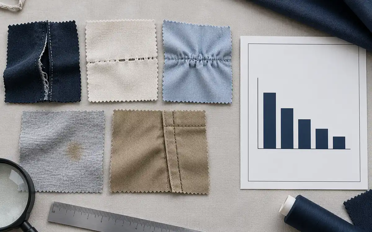
A weekly defect total tells a quality manager how much work was found, but it does not show where to begin. A Pareto chart for garment defects ranks defined defect categories by a chosen measure and can add their cumulative share. Used carefully, it directs the next investigation. Used carelessly, it turns inconsistent inspection coverage and loosely named faults into a confident-looking priority list. This guide builds a frequency Pareto, compares it with rework minutes and links the ranking to a practical corrective-action record.
Choose the measure before drawing the bars
A frequency Pareto ranks the number of observed defects. A time-weighted Pareto ranks the minutes attributed to those observations. A cost-weighted Pareto ranks a defined cost. ASQ's Pareto guidance recognises frequency, time and cost as possible measures. Choose the one that matches the question, and label it clearly. Defect count, repair capacity and commercial consequence can point to different priorities.
Start with one scope, such as first-pass end-of-line inspection for a specified product family and period. Do not casually combine incoming material faults, in-process observations and repeat re-inspection findings. The same garment may have several distinct faults, but one fault should not enter the dataset again each time it moves through rework. The event definition controls that distinction.
Keep critical defects on their required escalation route regardless of bar height. A rare safety-related or prohibited fault does not become acceptable because common cosmetic faults dominate the chart. The Pareto is a prioritisation aid within the applicable quality rules, not authority to relax a buyer's acceptance requirements.
Build a check sheet that can be audited
Record the inspection stage, date or shift, line, style or product family, inspected-unit count and defect code. Where useful, retain an inspection-event identifier and garment or bundle identity that lets the team detect duplicate recording. Include the location or operation only when it can be observed reliably. Do not label a suspected creation operation as a confirmed cause merely because the fault was found nearby.
ASQ's check-sheet guidance recommends defining the event and testing the collection form. For a factory trial, ask two inspectors to code the same small set of agreed examples, compare disagreements and resolve the code definitions before collecting the full period. This is a proposed calibration exercise; it is not a substitute for a formal measurement-system study where one is needed.
Use one code for each distinct observation. If open seam and seam gap are synonyms in your system, merge or clarify them at collection rather than splitting their bars. If one broad category contains different faults with different remedies, keep the broader category for the overview and investigate its components separately. Preserve the original detail so a useful drill-down remains possible.
The site's DHU guide explains the distinction between defect observations and defective garments. It matters here: a frequency Pareto of defects can exceed the number of affected garments. The defective-unit percentage cannot be recovered from defect category totals unless the garment-level information is available.
Calculate a complete frequency example
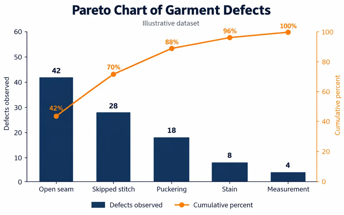
The following dataset is illustrative. A defined first-pass inspection scope contains 1,250 inspected garments and 100 distinct defect observations. The categories are mutually exclusive for each recorded defect observation, while a garment may contain more than one observation. Sort categories from largest count to smallest before calculating cumulative percentages.
Defect category | Count | Share percent | Cumulative percent |
|---|---|---|---|
Open seam | 42 | 42 | 42 |
Skipped stitch | 28 | 28 | 70 |
Puckering | 18 | 18 | 88 |
Stain | 8 | 8 | 96 |
Measurement | 4 | 4 | 100 |
Total | 100 | 100 | Not a chart category |
Open seams and skipped stitches account for 70 percent of observations. Adding puckering takes the cumulative share to 88 percent. That is the measured concentration in this teaching dataset. There is no need to force an 80/20 pattern: three of five categories represent 60 percent of categories, and their observed share is 88 percent. A Pareto chart reveals concentration; it does not promise a particular proportion in every process.
The scope's DHU is 100 divided by 1,250 multiplied by 100, or 8.0. That rate gives inspection exposure context. The cumulative line uses 100 defect observations as its denominator, not 1,250 garments. Putting the garment denominator into the cumulative formula would produce a line ending at 8 percent rather than 100 percent, mixing two different questions on one chart.
Make the chart easy to read and reproduce
Use category labels across the horizontal axis, count bars against a zero-based left axis and cumulative percentage on the right axis. Keep the sorted order visible and let the line finish at 100 percent. State the inspection scope, period and inspected-unit count beside the chart. Exclude the Total row as a plotted category; including it would create an artificial largest bar and double the sum.
Microsoft documents the native Excel Pareto chart for text categories paired with numeric values. Selecting two numeric columns can instead produce histogram bins. Check the actual source range and category order after creation. Interface availability varies by supported product, so use the documented feature or a verified column-and-line construction rather than assuming every spreadsheet application offers identical controls.
Do not ask an image generator to invent the chart's labels or values. Build the figure from the table, keep the editable data and manually or deterministically typeset the axes. A decorative illustration can introduce the article; the numerical chart must match the calculations. A reader should be able to reproduce every bar and cumulative point from the supplied record.
Re-rank the same observations by repair work
Frequency does not measure the time needed to recover a garment. Suppose, solely for this teaching example, mean attributable rework minutes per observation are 3 for an open seam, 1 for a skipped stitch, 5 for puckering, 8 for a stain and 12 for a measurement fault. These are assumed times, not standard repair allowances or verified factory measurements.
Multiply each count by its assumed repair minutes, then sort again using the new totals. Keep the basis clear if several faults are repaired together: summing separate allowances may double-count shared handling. In a real study, use observed repair records with a defensible attribution rule rather than adopting these illustrative values.
Category sorted by minutes | Count | Assumed minutes each | Total minutes |
|---|---|---|---|
Open seam | 42 | 3 | 126 |
Puckering | 18 | 5 | 90 |
Stain | 8 | 8 | 64 |
Measurement | 4 | 12 | 48 |
Skipped stitch | 28 | 1 | 28 |
Total | 100 | Not applicable | 356 |
Skipped stitches fall from second place by count to fifth by assumed minutes. Open seams still lead, representing approximately 35.4 percent of the 356 minutes, while open seams and puckering together represent approximately 60.7 percent. The time view changes the second investigation priority. It does not prove that every fault can be removed or that each repaired minute will convert into additional shipment capacity.
Turn the ranking into checks and actions
Select the highest relevant category and break it down by the conditions needed to discriminate causes: operation, fabric lot, seam position, machine or time window. Check that inspection coverage is comparable across those groups. A line inspected much more often can produce the largest count even when its defect rate is lower. Use rates with their inspection denominators when the question is comparative line quality.
For open seams, a useful investigation could distinguish inadequate seam capture from thread break or damaged fabric. Those are candidate mechanisms to verify, not conclusions supplied by the Pareto. QA and the process owner should agree the evidence to collect, the authorised correction and the effectiveness check. The site's statistical process control guide covers the separate task of assessing process variation over time.
Create one action record containing the selected category, observed pattern, suspected mechanism, verification method, owner, completion date and a like-for-like follow-up measure. State any change in product mix, inspection stage or sample coverage between baseline and follow-up. If the count falls because fewer garments were inspected, the chart has changed without demonstrating process improvement.
Keep the next review honest
Retain both rankings when they answer different decisions: frequency for recurring observations and attributed minutes for rework demand. Let critical-defect requirements and customer obligations sit above either ranking. Avoid moving stubborn faults into Other simply to make the main categories look better, and investigate growth in that residual category when it starts obscuring useful detail.
The next step is to trial one defined check sheet for a complete operating period, build the two rankings from the same observations and choose one cause-verification task. A useful Pareto ends with an owner checking a mechanism, followed by an effectiveness measure that uses the same exposure basis.


Discussion0
Loading the discussion…